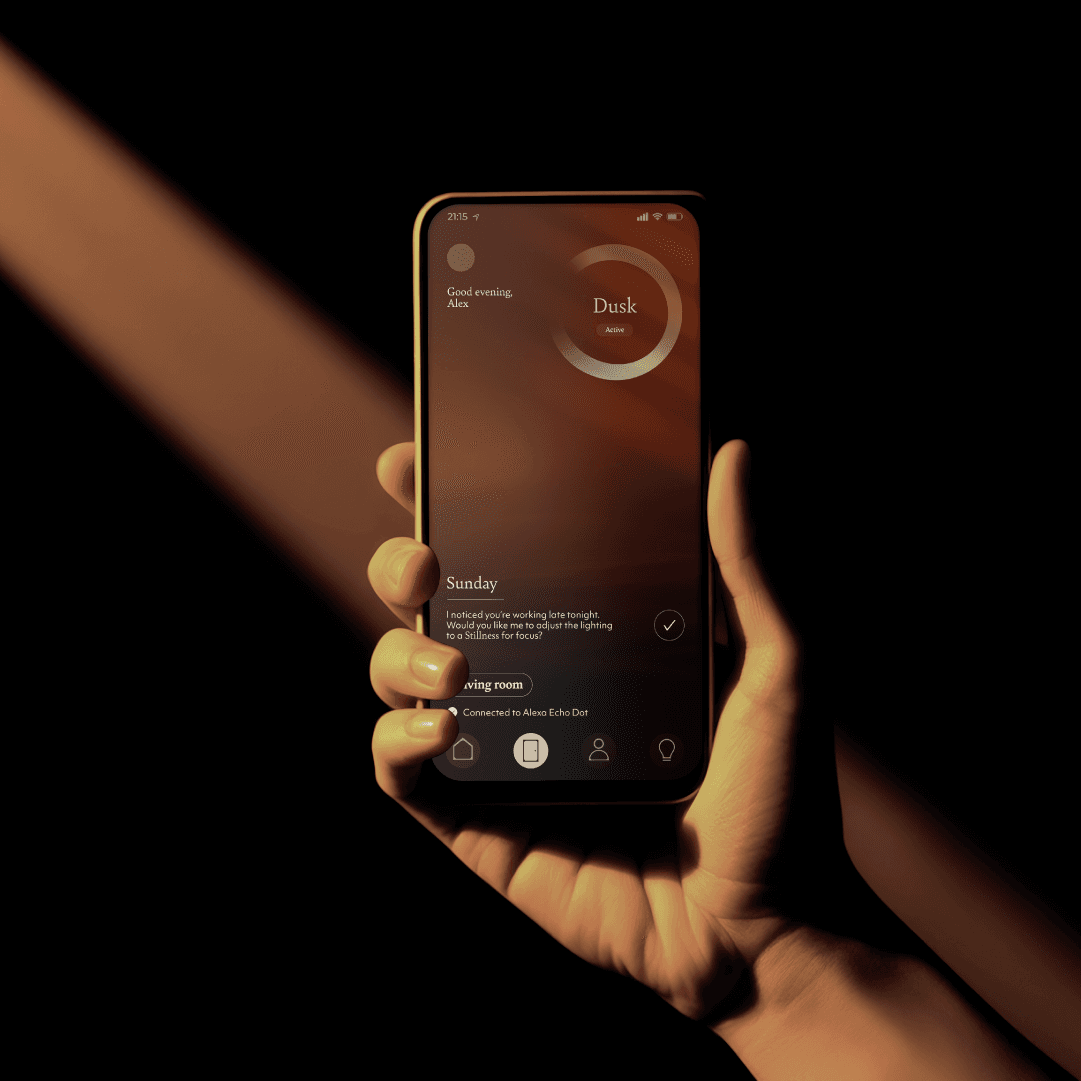
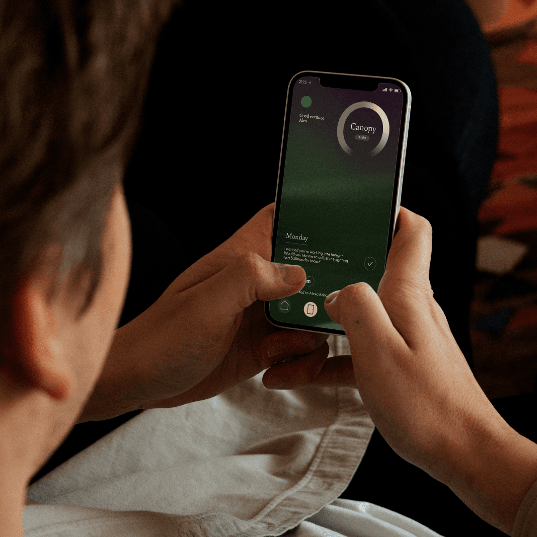
We worked closely with the team to uncover Auro’s real purpose - not just to light a space, but to support the people in it. Light that shifts with your rhythm. That knows when to soften, when to warm, when to hold still. Not commanding your day but responding to it.
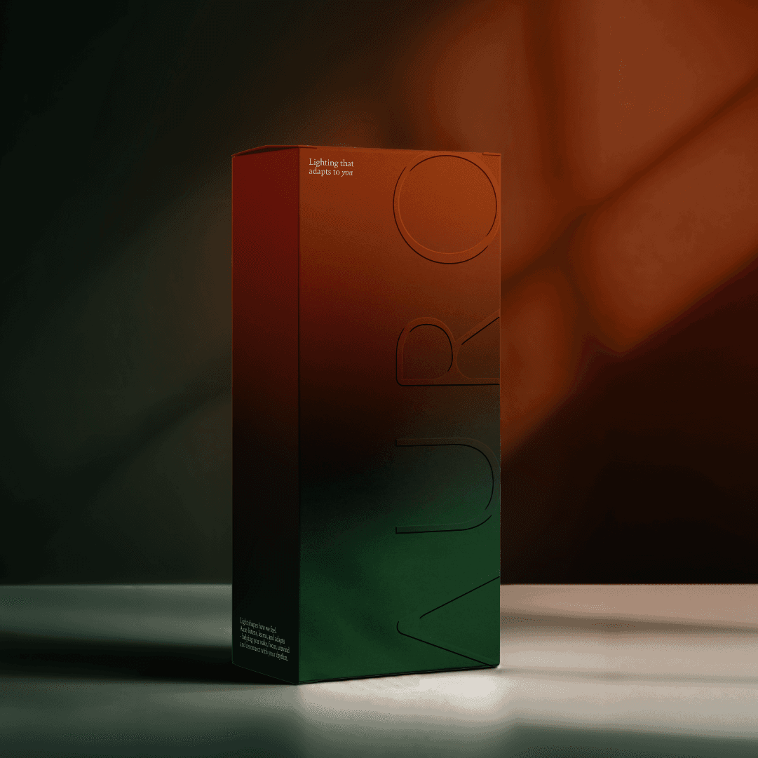
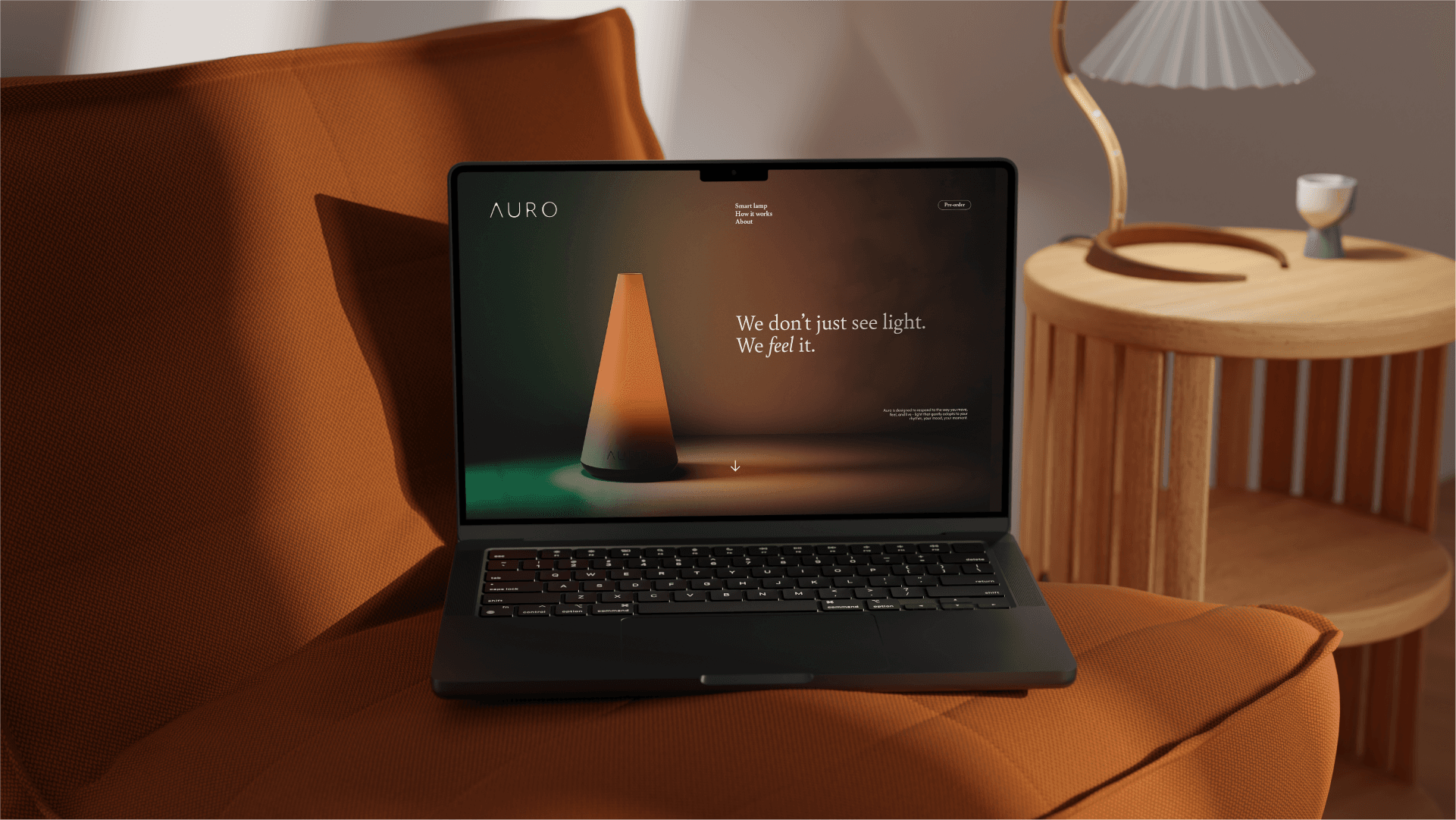
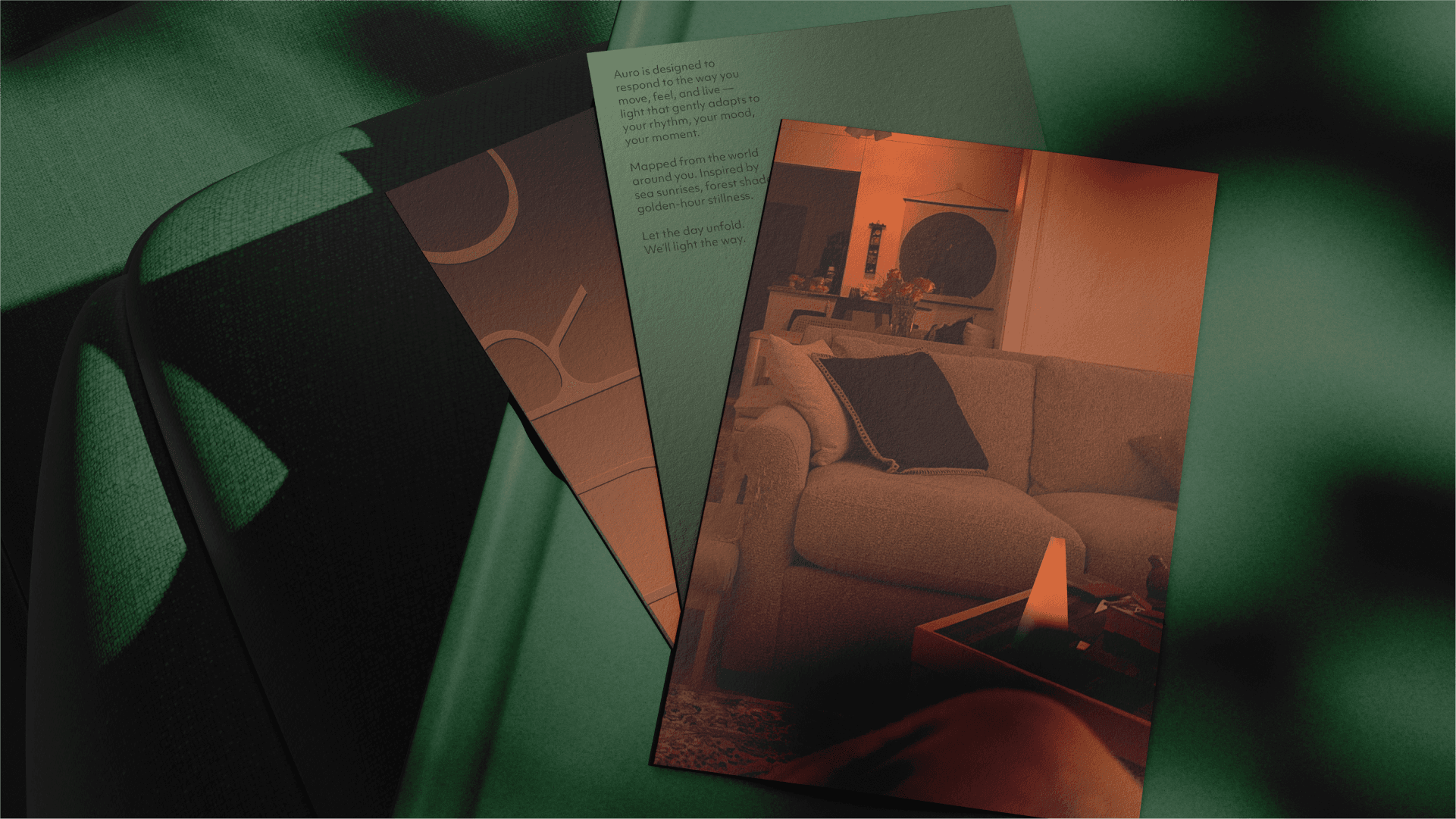
We responded with a visual identity rooted in atmosphere: deep gradients, ambient transitions, layered shadows. All inspired by sunrises, canopies and golden-hour stillness. The tactile packaging, the sculptural product form, all take cues from wellness, not Wi-Fi. The result is a brand that doesn’t just look, but feels.