
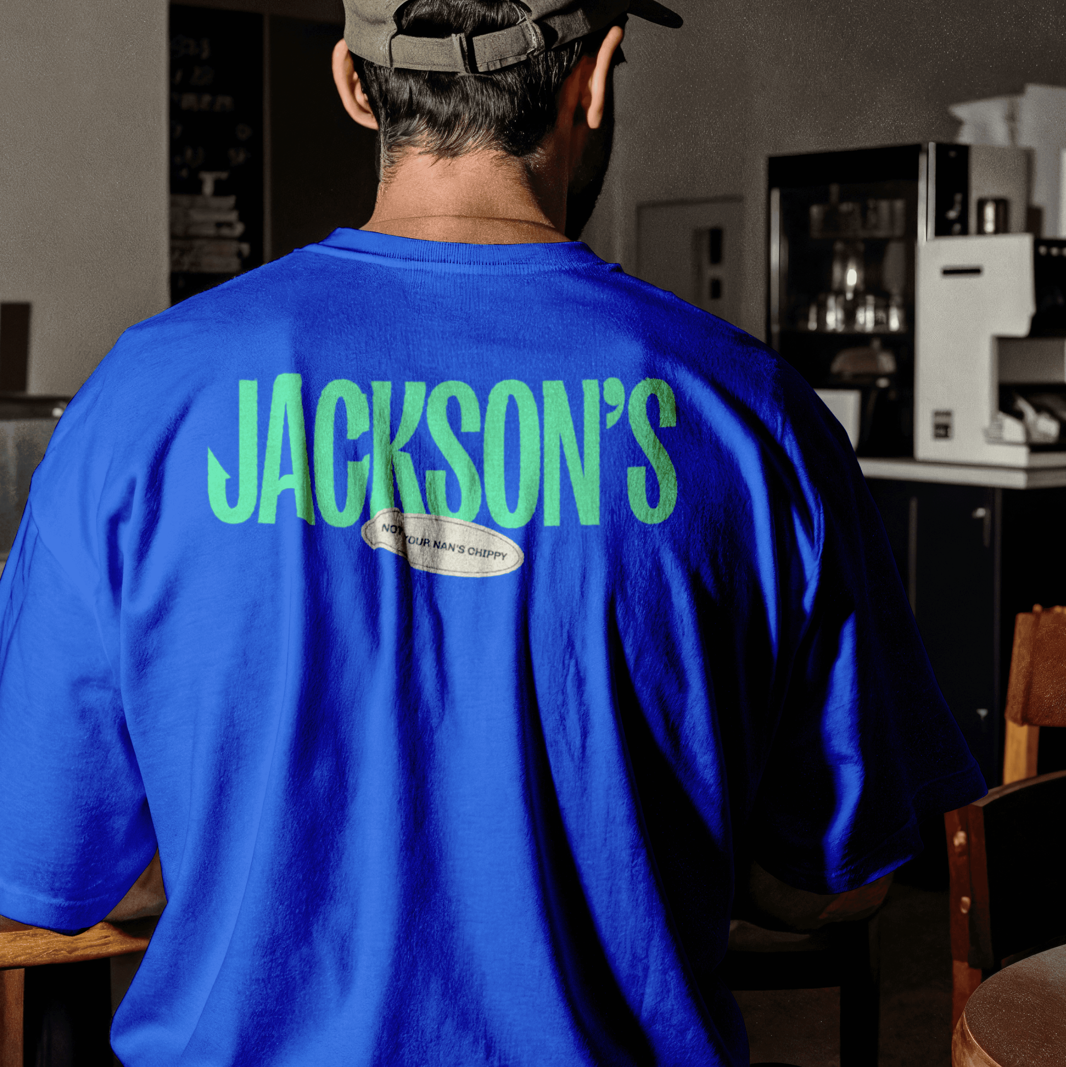
The identity pulls from the source, with holographic scale textures, electric blue, mint green, and sand tones that feel as fresh as the catch itself. Type is bold, forward-facing, and totally unafraid to cut through. The tone talking straight to a new generation who know their food and care how it’s caught.


The identity had to represent Jase in all his depth: a person who’s sharp and strategic, but also open, warm, and deeply human. We built a visual language that’s multifaceted and lived-in: a clean geometric structure, soft messy textures, and hand-drawn illustration. A system that feels layered, real, and representative, just like the people he’s here to support.


