Jackson's wasn't your grandfather's fish shop. They were sourcing sustainably, preparing expertly, and serving up seafood that would make you rethink everything you thought you knew about fish. But the category was drowning in nautical clichés and nostalgia porn.
Break every rule of seafood branding while making it clear this was still definitely about good food.

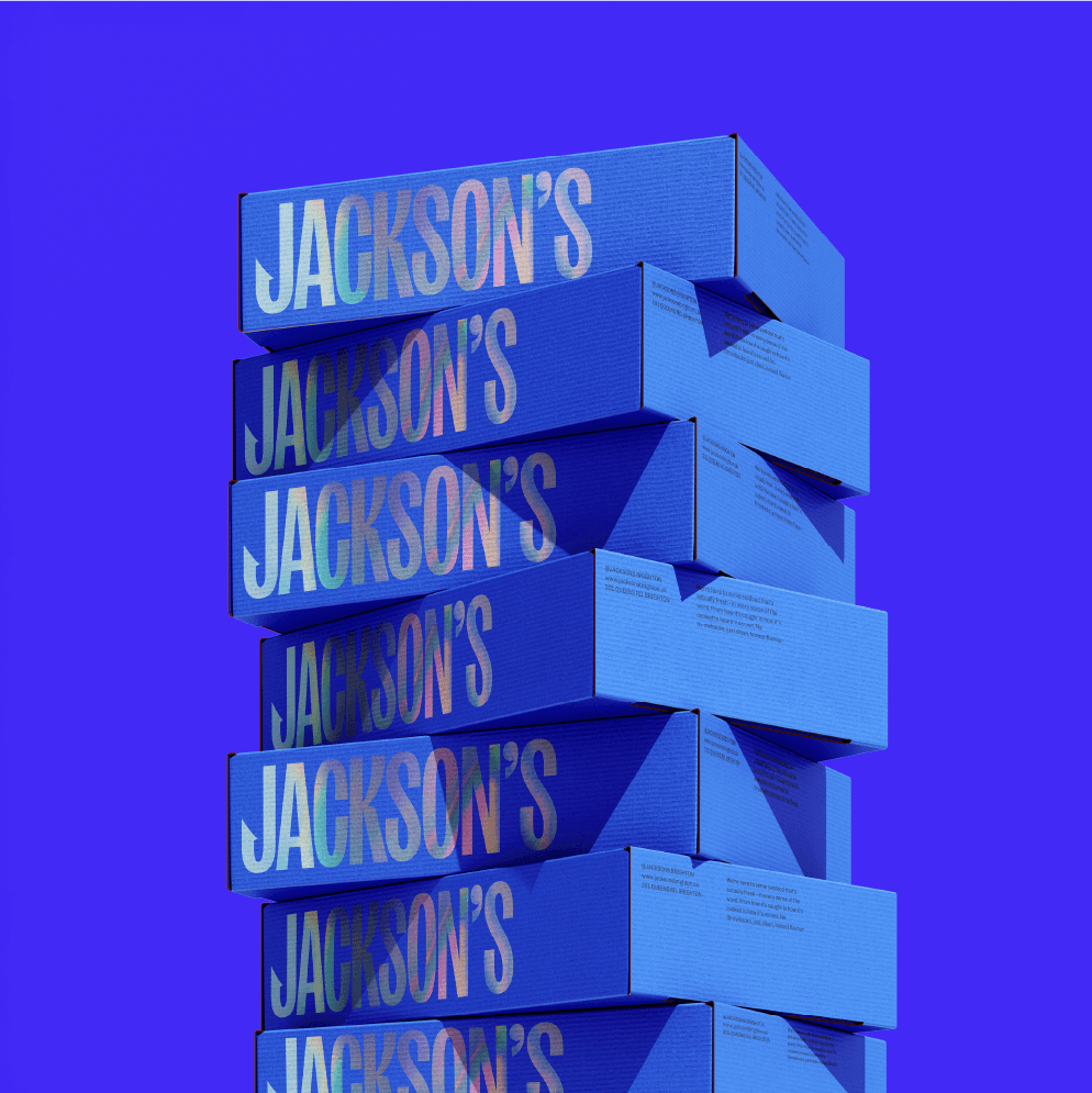
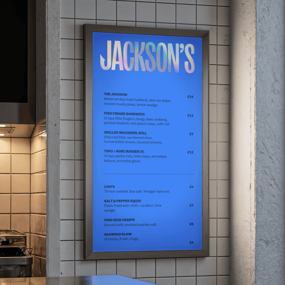
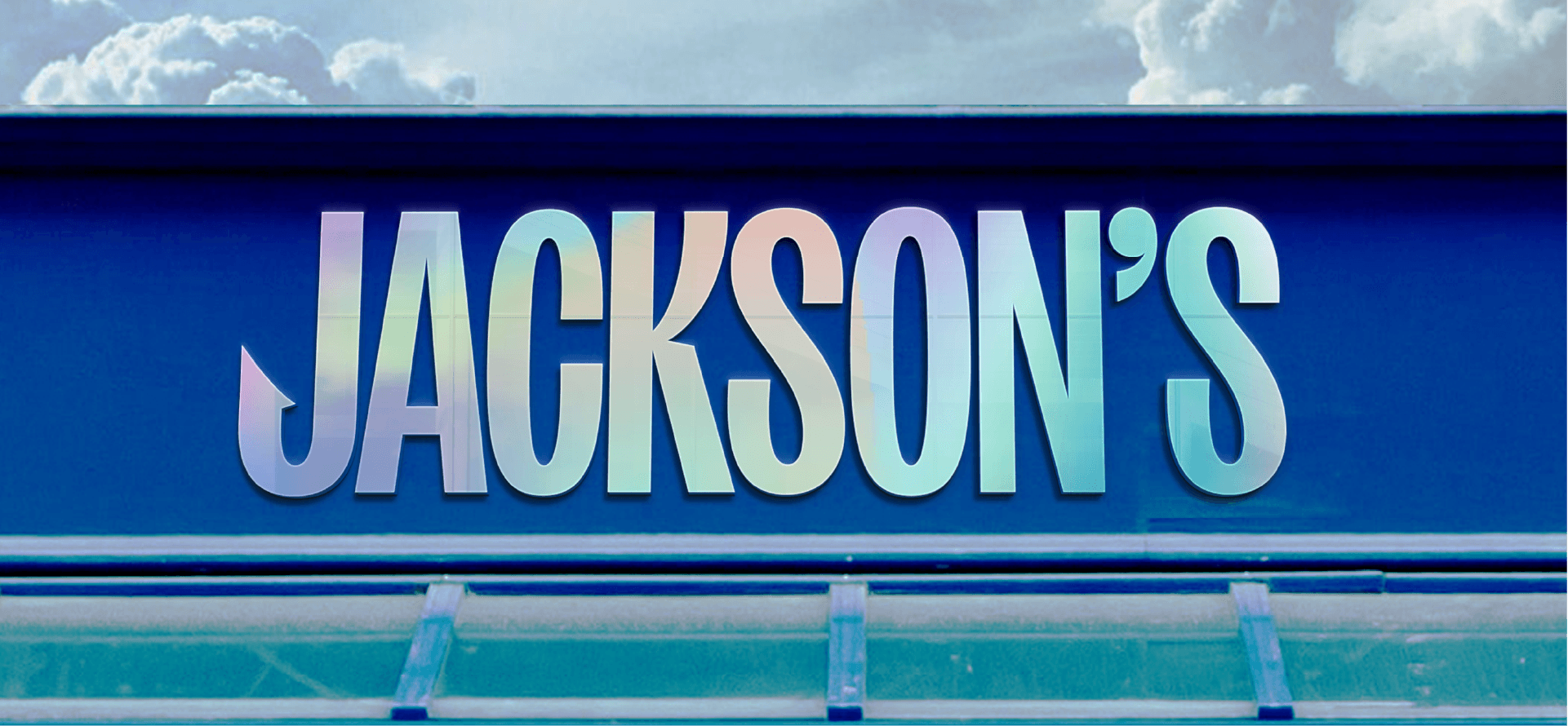
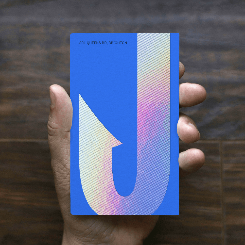
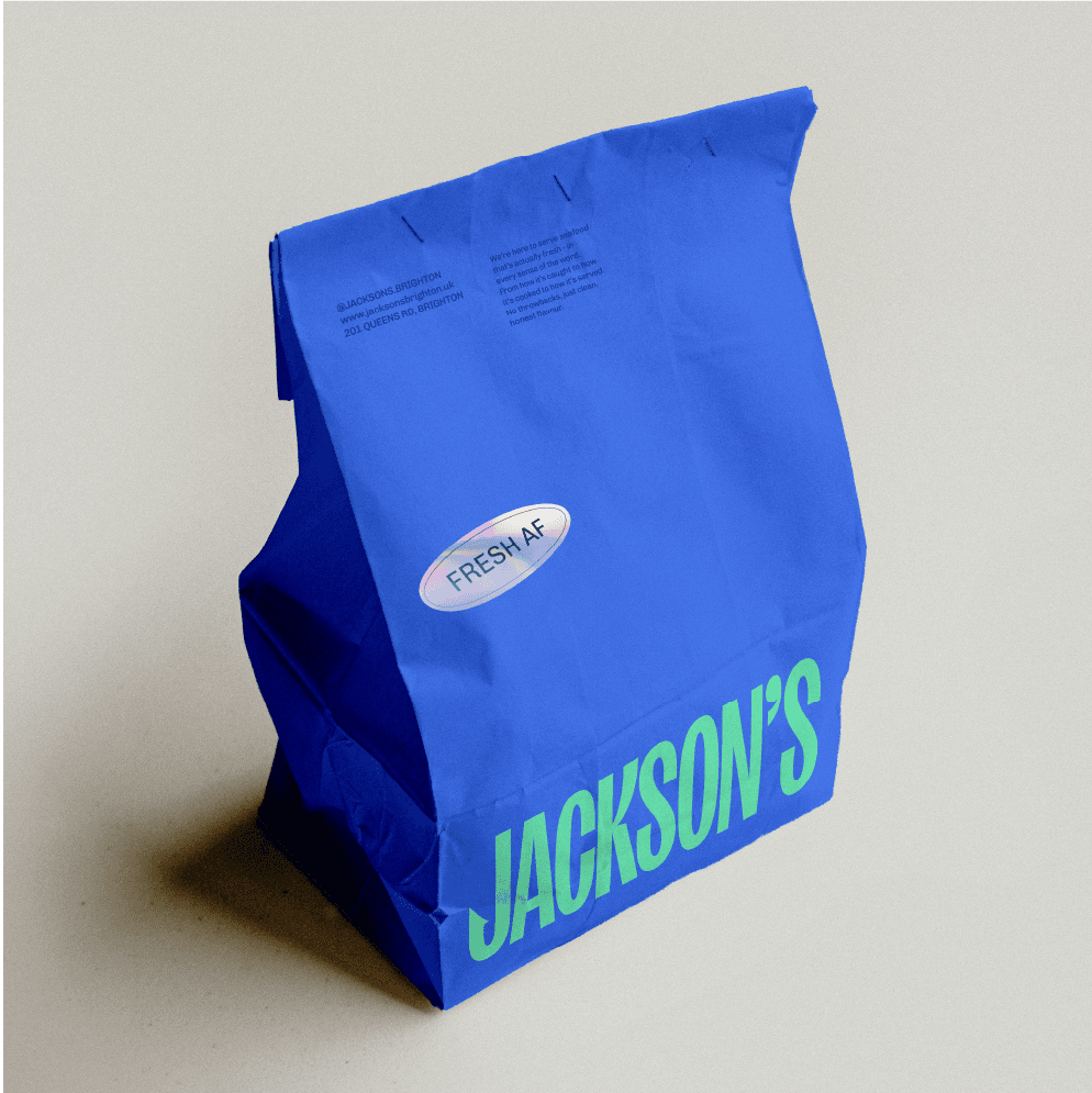
We ditched the fish illustration and embraced the future. Holographic textures that shimmer like fresh scales. Electric blues and mint greens that feel more Miami than marina. Typography that cuts through the noise like a perfectly sharp filleting knife.
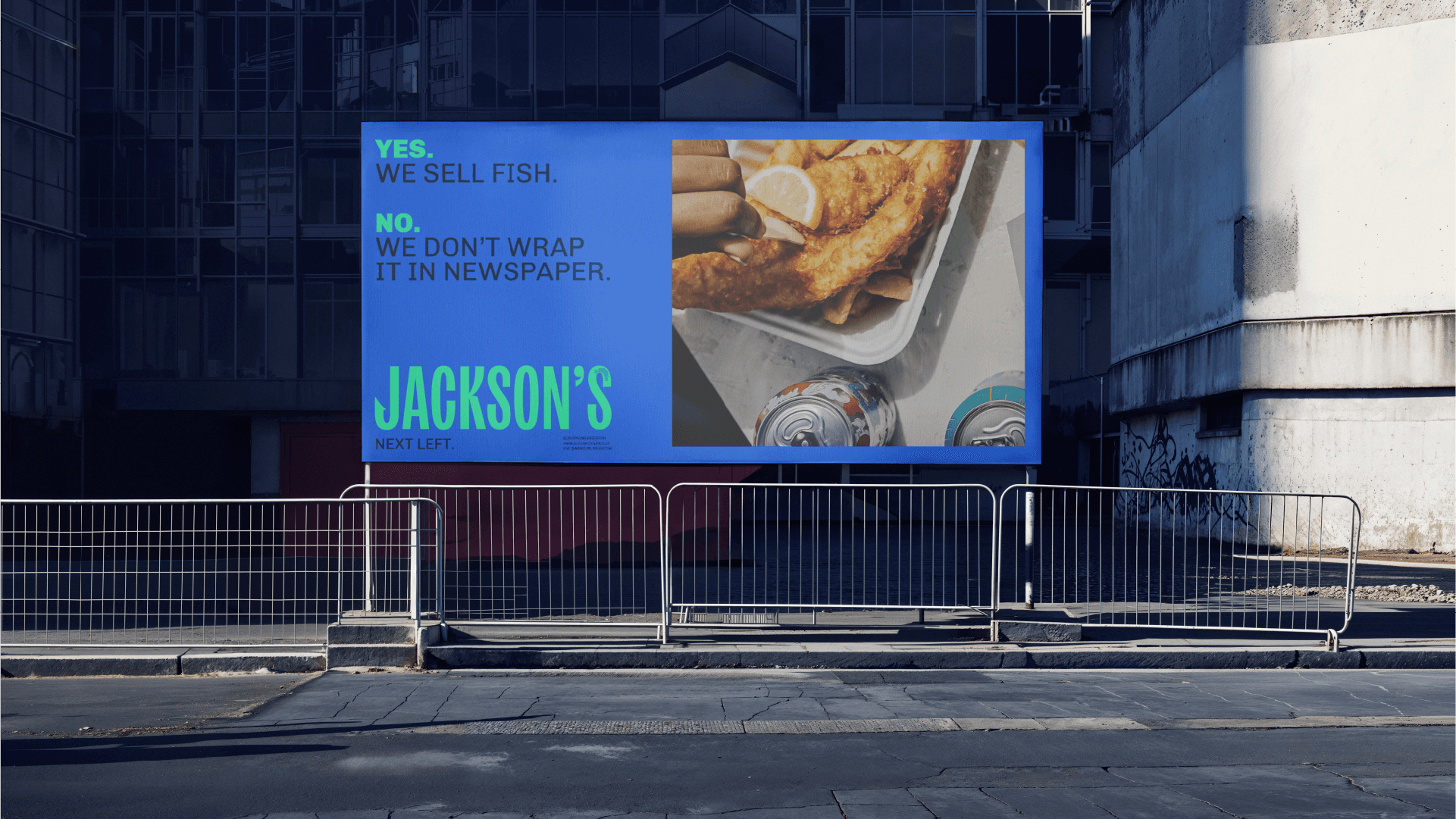

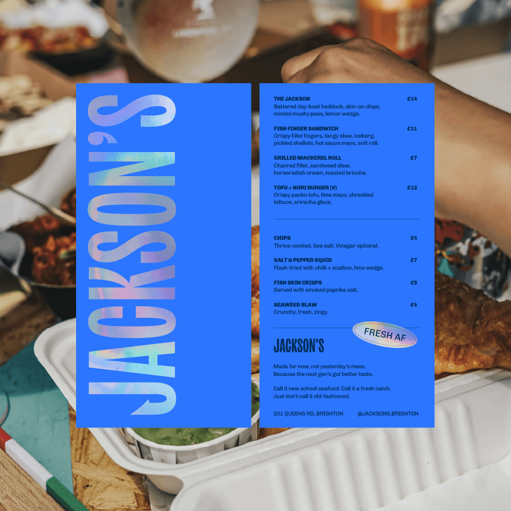
A seafood brand that looks like it belongs in 2025, not 1925. Because the future of fish is fresh, bold, and completely unafraid to make waves.
Featured on Beautiful Branding.
